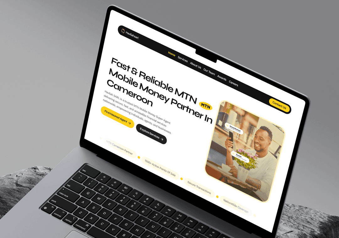
About Havilah SARL
Havilah SARL is a premier MTN Mobile Money Super-Agent dedicated to expanding financial inclusion. By bridging the gap between digital transactions and local communities, they provide secure, fast, and reliable liquidity and agent management services nationwide.
Establishing Brand Authority and Trust at Scale
Managing financial networks requires absolute trust. We focused on building a clean, highly authoritative visual identity that reinforces security, reliability, and Havilah SARL’s official partnership with MTN Mobile Money.
Key Design Principles
Premium & Luxurious Design
Crispy HD photo showcase
Trust Visualization (Testimonials)
Smooth Scroll Animations
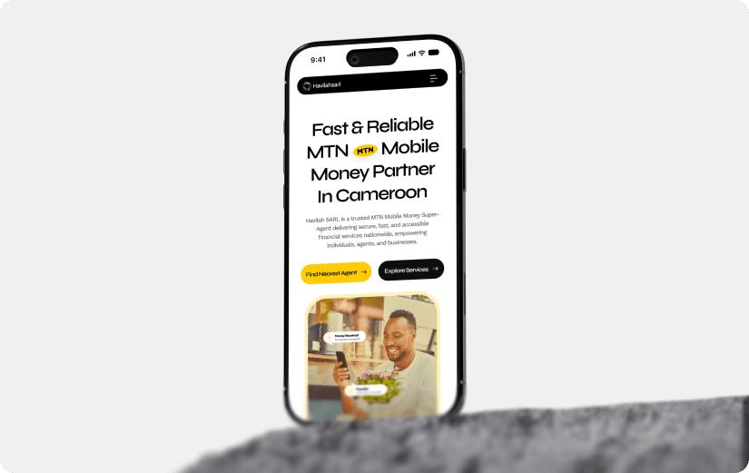
How we approached this project
We replaced the cluttered old look with a clean, modern layout. By using bold headlines, generous spacing, and sharp visual hierarchy, we gave Havilah SARL an effortless, top-tier look that instantly feels reliable.
01Leveraging MTN's Visual IdentityWe integrated MTN's iconic color palette and visual accents into the layout, creating an immediate connection that signals a top-tier official partnership.
02Refined Visual Hierarchy & ComponentsFrom crisp icons to modern card layouts, every visual component was refined to look lightweight, cohesive, and modern across both desktop and mobile screens.
03Clean, Modern & Trustworthy UIWe replaced the cluttered old look with a clean, modern layout using bold headlines, generous spacing, and sharp visual hierarchy for a reliable, top-tier feel.
Project Gallery
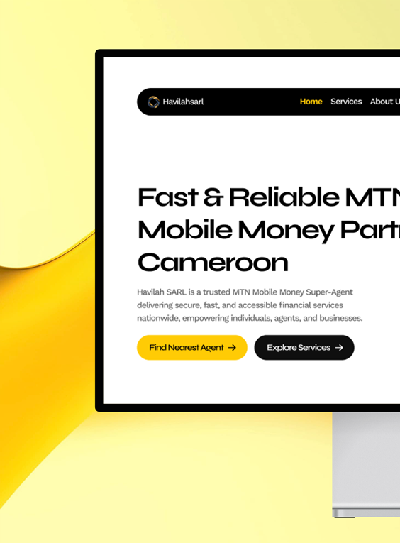
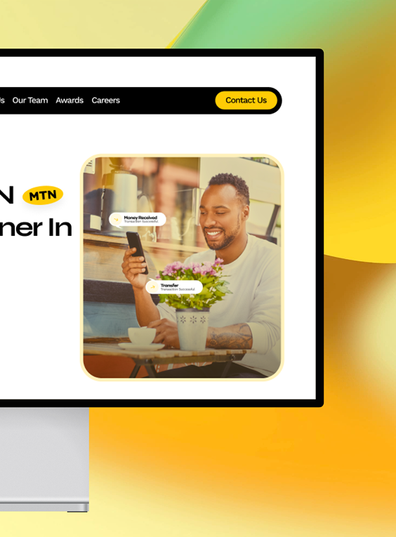
Key UX challenges and how we solved them
Balancing an established brand identity like MTN’s with a custom, high-end agency aesthetic comes with unique visual hurdles. Here is how we tackled those design challenges to elevate Havilah SARL’s web presence.
Seamlessly Integrating the MTN Palette Without Overwhelming the UI
Bright, high-visibility brand colors like MTN yellow can easily overwhelm a page if overused. We solved this by using neutral, high-contrast backgrounds with intentional yellow accents on high-priority CTAs and key visual highlights.
Modernizing Complex Financial Layouts into Clean UI
Dense financial tables and long feature lists often lead to cluttered, overwhelming pages. We transformed these complex layouts into spacious, modern bento-style grids with generous padding and intuitive visual grouping.
Elevating Low-Quality Brand Assets to a Premium Aesthetic
Using no imagery and bad contrasting colors weakened the site’s professional feel. We replaced clunky visuals with crisp, lightweight modern icons, custom graphic containers, and structured UI components.

Tech Stacks Used

Figma
Figma enabled seamless collaboration between the design team and Regal Treats, allowing for iterative feedback and rapid refinement of the packaging design.

React
We employed the use of React to build a dynamic, responsive user interface that delivers a seamless experience across all devices.

Node.js
We leveraged Node.js to build a robust, scalable backend infrastructure that supports seamless integration with various APIs and services.
See The Havilah SARL Visual Transformation
We took Havilah SARL’s digital identity from outdated and cluttered to sleek, authoritative, and perfectly aligned with the high-trust MTN brand ecosystem.

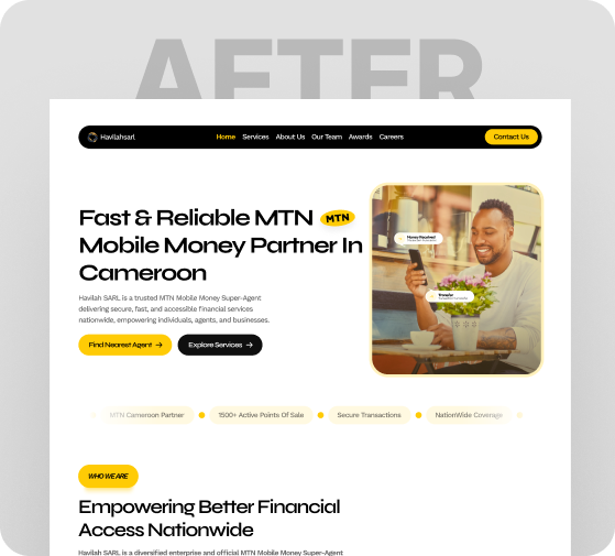
How Our Design Strategies Delivered Results
By combining a cleaner visual direction with stronger hierarchy and purposeful content structure, we helped Havilah SARL move beyond its cluttered old look—creating a more polished digital presence that communicates reliability, clarity, and a top-tier brand experience.
45%
Stronger brand authority
38%
Increased customer trust
32%
Higher agent engagment
