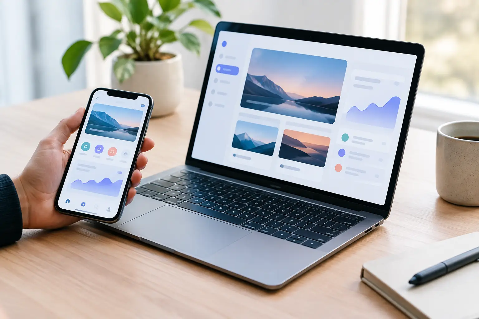
A polished interface is no longer enough to win attention or earn trust. The most valuable ui design trends 2026 are shifting product teams toward clearer decisions, more adaptive experiences, and design systems built for real operating speed. For founders and product leaders, the question is not which visual trend looks current. It is which choices reduce friction, improve conversion, and hold up as the product grows.
UI Design Trends 2026 Are Becoming More Intentional
For several years, digital products competed through visual novelty: oversized type, dramatic gradients, floating cards, and animation-heavy pages. Those tools still have a place, but the market is less forgiving of decoration without purpose. Users expect interfaces to explain themselves quickly, especially when they are entering payment details, comparing options, managing work, or making a time-sensitive decision.
In 2026, strong UI will feel confident rather than crowded. It will use visual hierarchy to direct attention, motion to confirm actions, and content structure to reduce uncertainty. The result may look simpler at first glance, but it is rarely simple to build. It requires a clear product strategy, strong content design, and disciplined implementation across screens and states.
This is particularly relevant for brands launching MVPs. Moving fast should not mean shipping an interface that creates support tickets, obscures the core action, or needs a costly rebuild six months later. The right design decisions create a faster route to market and a stronger base for iteration.
AI-Native Interfaces Will Replace the AI Feature Tab
The earliest wave of AI products often treated artificial intelligence as a separate destination. Users clicked an AI button, opened a chat panel, and hoped the system understood the request. That pattern is evolving.
The more useful approach is contextual assistance inside the task itself. A finance platform may suggest how to categorize a transaction while the user reviews it. A project tool may turn meeting notes into assigned tasks within the workflow. A commerce interface may help a buyer narrow a complex catalog without forcing them into a generic conversation window.
This does not mean every product needs a chatbot. In fact, a visible AI layer can add friction when users need a fast, predictable result. The strongest AI-native interfaces make the assistance feel specific, controlled, and optional. They show what the system can do, give users an easy way to review or edit outputs, and avoid presenting guesses as facts.
For product teams, this changes the design brief. AI UI needs states for uncertainty, feedback, revision, loading, and failure. If an answer is generated, users need to know whether they can trust it, change it, or trace how it was created. Good visual design makes those choices legible without overwhelming the screen.
Dense Information Will Get Better Structure
Minimalism is not the same as removing information. Business software, financial dashboards, healthcare tools, and logistics platforms often need to present a lot of data. Hiding it behind endless clicks can make the product slower and less useful for experienced users.
A major direction in UI design trends 2026 is intelligent density. This means giving users more useful information in the same space while preserving hierarchy. Progressive disclosure remains essential: show the key status, next action, and immediate context first, then let the user expand deeper detail when needed.
Better density depends on a few execution choices. Tables need clear scanning patterns. Filters should be persistent when they are central to the workflow. Status labels must be distinguishable at a glance without relying on color alone. Side panels, split views, and saved workspace preferences can help frequent users move faster than a series of full-screen transitions.
The trade-off is real. A dense interface can intimidate a first-time user, while an overly simplified interface can frustrate the person doing serious work every day. The answer depends on the product's audience, frequency of use, and cost of error. A consumer onboarding flow should not look like an operations console. An operations console should not force power users through consumer-style training wheels.
Motion Will Explain, Not Entertain
Motion remains a powerful tool, but 2026 will reward restraint. The best product animation answers a practical question: What changed? Where did it go? What can I do next?
A saved state can confirm completion. A subtle transition between views can preserve spatial context. A progress indicator can reduce anxiety during an upload, application, or payment flow. These are functional moments, not visual filler.
Heavy scroll effects and elaborate entrance animations still work in the right brand setting, particularly for high-impact marketing experiences. But they can hurt performance, distract from the call to action, and create accessibility issues when applied without discipline. Motion should respect reduced-motion preferences and never delay a user's ability to interact.
For launch-ready products, test animation under real conditions, not only on a designer's high-performance device. If it stutters on mid-range mobile hardware or blocks a key workflow, it is not adding premium value.
Accessibility Will Be Visible in the Interface
Accessibility is moving from a compliance checklist to a visible quality standard. Products that offer readable type, clear focus states, strong contrast, flexible text sizing, and keyboard support feel easier for everyone to use. They also communicate that the business has considered the full customer journey rather than designing for an idealized user.
In 2026, expect more interfaces to use larger tap targets, clearer error messages, and less reliance on placeholder text as a label. Forms will increasingly explain requirements before a user submits. Empty states will provide direction instead of dead ends. Error states will identify the problem and the next step in plain language.
This is where design and development need to work together from the start. Accessibility cannot be fully repaired through a final visual pass. Semantic structure, component behavior, screen-reader support, and interaction states all affect the finished experience. A premium interface is one that works when conditions are imperfect: the connection is slow, the screen is small, the user is distracted, or assistive technology is involved.
Design Systems Will Prioritize Speed Without Looking Generic
As organizations release more pages, features, and product variants, one-off design decisions become expensive. Teams lose consistency, developers rebuild familiar patterns, and every new screen turns into a debate about spacing, buttons, and behavior.
The answer is not a rigid component library that makes every product look the same. It is a practical system with clear foundations: typography, color tokens, spacing rules, components, responsive behavior, and usage guidance. The system should protect the essentials while allowing enough range for high-value moments such as a conversion page, onboarding sequence, or account dashboard.
The most effective systems are designed around decisions that repeat. What does a primary action look like? How does validation behave? What happens when a data table has no results? How should a card respond on mobile? When those answers are documented and built into reusable components, launch velocity improves without sacrificing polish.
For early-stage teams, this does not require building an enterprise-scale system before the first release. Start with the components that support the critical path. Expand the library as the product proves where repetition and complexity are appearing.
Brand Expression Will Move Beyond the Hero Section
A distinct identity still matters, especially when AI tools make generic layouts easier to produce. But brand expression is moving beyond a bold homepage headline and a color gradient. The strongest products make their personality visible in interaction design, illustrations, writing style, loading states, data visualization, and the level of precision users feel throughout the journey.
That does not require visual excess. A B2B platform can feel premium through carefully balanced type, an intentional content hierarchy, and calm, precise feedback. A consumer product can feel energetic through responsive motion, expressive color, and sharper microcopy. The right direction comes from the brand position and the user's emotional stakes.
When design, branding, and engineering are handled as separate phases, these details often get diluted by launch. An integrated team can protect the original product intent through design, development, QA, and post-launch iteration.
What Product Leaders Should Do Next
Treat trends as signals, not instructions. Before adopting an AI assistant, complex animation, or a new dashboard pattern, identify the business outcome it should improve. Is the goal higher activation, fewer abandoned forms, lower support volume, faster task completion, or stronger retention? If the answer is unclear, the feature is probably not ready for the roadmap.
Then audit the current experience around the moments that matter most: first visit, sign-up, first successful action, payment, and return use. Look for hesitation, duplicate steps, unclear labels, and unnecessary handoffs. Those are usually more valuable opportunities than a visual refresh alone.
The best interfaces in 2026 will not chase novelty for its own sake. They will make sophisticated products feel understandable, capable, and ready to use. Build for that standard, and every release has a better chance of earning trust before it asks users for commitment.